So, if you'll notice, there are crossed swords behind the slug on the lower part of the new Sabres scoreboard. I'm sure many fans are excited by this, and might even be thinking "that would help our logo out a lot!"
Pardon my bluntness, but when I see that, all I can think is "PHAIL."
The lack of crossed swords is only one part of my hatred for the slug. While their inclusion on the scoreboard is nice, and reminds people of the actual team name (you know, the SABRES), the slug is still as impotent and silly as ever.
So if Larry Quinn thinks he can fool people into accepting this new idea as some sort of compromise, I hope that you'll be smarter than that. Remember, a polished turd is still a turd.
So help me if that ends up on our third jersey next year... *gag*
Sunday, September 30, 2007
New Scoreboard... Swords, Huh?


Saturday, September 29, 2007
Swords behind the Slug on the awesome new scoreboard?
Slugbres...You're getting there Larry, my hat's off to you!
Friday, September 28, 2007
Here's how you fix it...
Sorry to steal your title, Chris!
"It was easier to start from scratch," said Frank Cravotta, Sabres director of creative services. "When your old logo is such an icon, it's hard to redo it."
This was a quote taken and recorded by the Buffalo News at some point last season during the logo leak. What bothers me most is that there were over 80 logos to choose from and the slug is what RBK and the Sabres thinktank settled for.
So in regards to that quote I would disagree. I could not imagine the current logo's merchandise ever outselling the examples below if a new logo is professionally done to mirror what regular joes have done with paint and photo shop...


Or if someone makes it into the real thing...
And here...


Saturday, September 22, 2007
Greetings Sabre Faithful!
My oh my, what a year it was! I wanted to take this opportunity to chime in on a few matters.
First, thank all of you who contacted me during the last year. Your passion and support were greatly appreciated, and I hope that you all have kept up the good fight in your own way.
Secondly, I want to thank Charlie for keeping the protest alive, and for his excellent work on digging up hard numbers and information about how the slug came to be.
Finally, an overall update.
We are a year removed from the Fix the Logo drive, and while some of you have "gotten used to it," or let it "grow on you," I myself am still insulted and disgusted by the incredibly weak, trendy, and downright ridiculous logo that the Buffalo Sabres have chosen to represent them.
For any who are wondering what happened to me and the protest, when the season started, and our worst fears proved to be true, I decided to stand back, and enjoy what was a wild ride of a season. It was no sense being the lone wet blanket as the entire Western New York community, and even abroad, was swept up in Sabre Fever.
The 15 home games in our true uniforms brought a smile to my face, and only cemented my belief that our original uniform and logo remain our best to this day. Here's hoping the Sabres "brain trust" (and I use that term very loosely) don't screw up what should be a no-brainer for our retro third jersey next season.
Lastly, if you are still looking for somewhere to point the finger on the origin of the slug, I am here to reaffirm that the blame lays squarely on Reebok.
I have been privy to a plethora of information and history on the uniform and logo development in recent weeks. I have even seen a locally-designed logo design that tested extremely well, among fans and Sabres management alike, that was all but approved prior to the 04-05 lockout. I wasn't looking at a graphic on screen either. I was looking at the actual physical crest that would have graced a jersey. Believe me when I tell you that it would have been FAR greater than the slug in every respect.
It was during the lockout however that Reebok swept in, and all of the work that was done locally was shot down, and full control was seized by Reebok. The rest, as they say, is history.
Now, more than ever, I believe that while the company line is that "teams have final say" on all logo and uniform decisions, it is in fact Reebok who holds most of the cards. The Sabres current uniforms were not very well received when Reebok unveiled them to management and players. Sales might have changed their opinion, but if teams are so involved in the process, why should they have been surprised and disappointed in what they got? When a team like Chicago openly states that it had to fight hard to keep their uniform intact, that is telling.
Here's hoping that the NHL asserts more control over their own image in the future, but given who runs the show, it's doubtful.
In closing, I just want to encourage everyone who still loathes the slug to never give in. Don't buy anything but the vintage merchandise. Leave the slug sitting on the shelf. There is plenty available if you know where to look. Ice Jerseys has some nice items on sale, and they will be getting in vintage jerseys in October. Check out their current Sabres selection here.
So here we are, after quite a tumultuous off-season, Larry Quinn is still in charge, and the slug remains. Vote with your wallets, and don't let management nor ownership off the hook. Take them to task at your every opportunity. Call into the cheerleading "Voice of the Sabres," WGR550, and voice your opinions. Write the Buffalo News. Write on hockey forums. Stay vocal.
But whatever you do, don't be complacent.
Go Sabres.
Thursday, September 20, 2007
Top logo design don'ts
From logodesign.com:
1. Designing a logo that is too trendy. Your logo needs to have some longevity.
2. A logo that arouses unwanted associations. Does the logo look like a falic symbol, or some other unintended shape? 
Looks like number 2 is a no brainer...
(I have the original copy at home, but that was given to me by a fellow coworker who isn't even a hockey fan but is a fan of safety scissors and sharpie markers.)
3. Doing your logo yourself. (Unless, of course, you're an experienced designer)
4. Forgetting about your customer.
5. Looking too much like your competitors.
6. Thinking that colors and fonts don't matter.
7. Trying to communicate too much with your logo.
8. Stay away from gradients and blends of color.
***If you go by their criteria, the Sabres seriously ignored at least 6 of the 8 points and could be argued for ignoring all of them.
Wednesday, September 19, 2007
We are all Sabres fans no matter which logo you love.
In all of this and I never wanted to categorize people in different levels of "fandom" in this whole logo dispute nor should anyone be slapping ultimatums on each other and labeling those as bandwagoners...there are slug haters, slug lovers, indifferent fans, and those on the fence. But we are ALL Sabres fans and shouldn't be trying to undermine someone by which version of blue and gold they prefer...but more for me I take issue with the logo and it's poor representation of the team and was only trying to outline there are better alternatives both from the past and potentially in the future if fans who dislike the logo actually extend beyond a message board and do something about it.
Instead of buying slug crap, I spent my time and money and tried to inform others of a pracitical and potentially more profitable and long term solution for the Sabres. A logo that offers an updated throwback look to it, designed by a guy who loves the team. And this has been available since 2003 and somehow is still very popular to this day.
I look at the slug and see no inspiration or emotional connection when I try to imagine the donkey or donkeys who drew it up. It was just an account dropped in some design firm's lap thousands of miles away. Maybe I shouldn't have brought John Slabyk back into the limelight because now all of these people call him some egomaniac. He is a talented man who doesn't need the Sabres logo for his big break. He is very successful on his own accord and I would consider his New Blue and Gold project as his passionate shot at rebranding the team during it's transistion from Adelphia into it's current ownership because he cared and had the talent to try to bring back blue and gold to Buffalo before anyone else. No one solicited me to do this, I was motivated by the lack of insight the Sabres gave fans in this whole process, John's work no doubt, and also offended that his work or a likeness was not used by the Sabres in the update. Drew Celestino as well had over 30,000 people in collective agreement early on with his petition. And while I enjoyed every win, a 10-0 start to the season ignited everyone's amnesia about the issue. Drew stepped back and let people enjoy the season, I enjoyed the season but Larry Quinn said it was alright to yell at him if we didn't like the logo identity he slapped on the team and more or less shoved down your throats. I gave it a year and still didn't like it, I didn't get used to it, or bought it even though I hated it. And so I am yelling now. Politely and constructively.
Besides deep down, how is the managing partner of the team so truly confident in the "new" look that he is quoted last season as saying that they would wear the vintage uniform in a Stanley cup clinching game situation?
I suppose my fatal flaw is that I happen to hold a little more weight that no matter how good or bad a team plays, they have a right to look good whether they play poorly or not. What is a team to do for extra revenue from merchandise if they play like crap and look like it too?! I feel that way about all pro sports teams.
What has always bugged me about the logo is that I hear all the time how fans either hate it and feel helpless about it, don't like it but bought slug merchandise anyway, and those who naysay and offer no constructive comments to the discussion other than, "give it up" or "I hate it but it's here to stay"...only because you LET IT STAY.
Big picture...think about what that logo will mean to the team 10 years from now...look around, our own team and other teams' fans don't even call us Sabres anymore. We are only one year deep in this thing. This RBK Edge Uniform system leap of faith the NHL and RBK Executives are bridge jumping also are expecting a robust shelf life for their new love child. Remember that the Sabres uniform design and logo was the NHL's initial guinea pig for this new uniform "innovation".
The logo draws an embarassing association. We already have folks calling out for the vintage during the Winter classic at the Ralph. I totally agree. Anything with "Classic" in the title should be handled appropriately in my opinion. The current logo is a yellow Bills logo ripoff to me. Can Marshawn Lynch skate and man the crease? Can Ryan Miller run a 65 toss power trap? The current Sabres logo absolutely sucks and ruins what to me is a otherwise fantastic uniform! Whether you agree or not in my eyes does not make people any less of a Buffalo Sabres fan. And whether or not if you choose to buy the slug or vintage gear you can still support the team with or without your wallet.
Friday, September 14, 2007
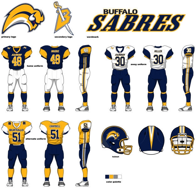
The new NFL expansion Buffalo Mollusks...
This logo almost works on a helmet...or better yet the Univerisity of California at Santa Cruz could use this for some inspiration for their football uniforms...if they ever get football. Remember, they wanted to be called the Banana Slugs ON PURPOSE and that's why I hug their slug.
I must say whoever designed this, I want to send you a gift certificate to Red Lobster, my treat. That's a promise.