What is the goal of Sabres Not Slugs?
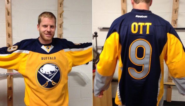
It has been well over a year since the new Buffalo Sabres logo was released to the public, and on a personal level, and I remain extremely dissatisfied with the organization's decision to put this on their uniforms. I noticed that a lot of the people out there on the internet who were dissatisfied with the logo and the overall return to blue and gold in shape or another some suggestions on how we can specifically go about getting the Sabres to eliminate the logo as soon as possible. I wanted to offer additional support to Drew Celestino's FixTheLogo.com website by adding a potential direction that fans could follow in regards to getting rid of the current logo. The solution the site orginally promoted is to implement John Slabyk's logo from the new blue and gold project on the current jersey with the idea the NHL will continue to offer the vintage third uniform in 2008-2009 or use the vintage as a primary jersey and the current uniform with John Slabyk's logo as an alternate third uniform. But now as reality set in, the most realistic cost effective idea for the team is to bring a full time return to the vintage and make the current jerseys the alternate third.

Whether John's hard work can see reality or not, the goal of it is to see that slugo disappear from every jersey, t-shirt, mouse pad, pint glass, and license plate and have justice done to creating a time tested identity for the team or going back to the classic crest that was iconic and never broke to begin with. If the Sabres insist on keeping the "slug" by all means please make the vintage the primary jersey and have the "slug" as a third alternate and wear it a grand total of ZERO times for games from here to eternity.
I also was disappointed that the Sabres and RBK International never had the courtesy to respond to my letters asking for insight and answers into the Sabres logo and uniform design process, in particular, how the Sabres uniform design was influenced or restricted by RBK's now failing "Edge Uniform System."
Why do you dislike the logo?
From an aesthetic standpoint, the dark blue updated logo or the classic logo itself would most likely help the current white uniforms' clarity on television as well as in print, while the current yellow logo causes the jersey front to appear blank from a distance, due to an overuse of white space. The original logo would better contrast with the white of the away jersey, while its yellow border would have the same effect on the navy-blue jersey. It's a real head scratcher as to how this white-space effect of the current logo wasn't noticed in testing. The Washington Capitals went through multiple TV-camera tests with Comcast Sports, simply to verify how the uniform would look on television. We have no idea how (if they did at all) the Sabres tested their uniforms for television... In general, very few details and explanations have been offered by the team.
In a calculated public-relations gesture designed to placate the fans, Larry Quinn merely offered a vintage-style third jersey, paired with the non-matching, dark-blue pants of the current uniform, which was to be worn at fifteen home games. All the while, they continued to evade questions and criticism regarding the logo controversy, such as why an updated variant of the classic Sabres' crest could not be used on the uniform. Quinn has been quoted as saying that they tried to incorporate the original emblem, but vaguely concluded that they "couldn't make it "work". Larry Quinn dismissed the fans' uproar "passion." We are indeed passionate about the Sabres, but scores remain extremely embarrassed by the logo. Did it really take the Sabres and Reebok three years and over $200,000 to invent the brand identity that we see on the ice today?
Do you think that the league will review the logo situation?
There are mixed reviews regarding the league wide adaptation of the RBK Edge jersey so far. The biggest concern is that will logo tradition and integrity be maintained by the league, RBK, and individual design firms who are at the drawing board. I would say teams like Detroit, Chicago, and Montreal should be untouched and rightly so because any drastic changes and fans might set the cities on fire. Other issues are as new teams unveil is that RBK appears to have done a "template" on teams by restricting horizontal stripes in implementing vertical striping and piping of various uniforms. We may soon enough find we have legions of upset fans of what RBK and/or design firms have done to tarnish teams identities for the sake of function over form.
In regards to Buffalo, I've received no solid answers from RBK or the Sabres. I can only speculate that the Sabres design launched a year early of the league wide adaptation is a guinea pig and litmus test of RBK's functionality and styling of the Edge uniform. The logo itself could have been a victim of RBK's vision and constraints to tuck in the uniform and thus limit the logo size. That could be an acceptable explanation but no doubt that the bottom line in the approval of the logo fell on the lap of Buffalo Sabres ownership and the "managing partner" Well that has been squashed since we see classic circular logos with teams like Boston (who look fantastic!) and recently the New York Islanders. The astute folks out there can appreciate the functionality of the RBK Edge uniform for players on the ice but regular fans at a game could care less if their beer soaked jersey (that they paid either $110 or $250 for) weighed a couple ounces less because of an innovative fabric design.
Is this issue still alive, potentially, and by what mechanism can this logo still be reviewed, if at all?
I think it is still alive. But It's a tough question and answer.
Essentially why would you want to get rid of a uniform on a logo that allegedly was selling 600% higher than the previous year's "Goat head" era jersey? Again the Islanders in 1996 boasted their fish stick logo as high as number four in league sales and most fans know what happened. Remember that was for an awful team at the time with a very rich history. The "slug" was a fluke cash grab perpetuated by eager and genuinely happy fans in anticipation to return to the blue and gold, and coupled by the outstanding play of the Buffalo Sabres during the course of the season. Those huge sales figures posted make no distinction between sales of the "slug" jersey and the sales of the vintage thirds as well.
I think the only eye opening factor to initiate review is for the "slug" merchandise's sales to diminish dramatically and for fans who are concerned to get active in generating consistent feedback and correspondence with the team and media outlets. And why would fans who paid good money for their Drury and Briere and other "slug" jerseys last year want to pay a substantially higher price point AGAIN this season in consecutive years for an RBK Edge jersey that essentially will still carry the "slug" with no tangible changes? Additionally, the Sabres and all NHL teams will be without an alternate third vintage jersey until it's available in 2008-2009. So Sabres fans will have a whole year to watch only the "slug" with no hope for relief by a game with the vintage uniforms. Again that is where I see sales dropping off and an opportunity for management to re-think the logo's feasibility long term and get it right and focus on establishing or returning to a long term brand identity comparable to the Red Wings, Bruins, or Canadians. That seems to be the trend anyway in all professional sports; leaning toward modern throwbacks as primary uniforms. Knowing when not to change is a good thing. And it's a best practice of logo designers to never create something that has drawn unwanted associations with its image...creating a logo resembling a goat head or mollusk is simply a total failure in that respect.
I'm all for the Sabres generating revenue, filling the HSBC arena, and enjoying economic profit but management and ownership should have put more consideration into the blue and gold return and not mislead the fans about not delivering what I would call a complete return to the blue and gold. That means offering a vintage logo or an acceptable updated variant of the original crest as a PRIMARY uniform and identity. I think this idea would far outsell and exceed the shelf life their marketing geniuses anticipate for the "slug". I do not believe that a team who has sold over 14,000 season tickets in an 18,000 seat arena would be struggling by any means.
All I can say is look at the excellent new Boston Bruins design and wonder as a Sabres fan why couldn't have something like that be offered. I personally would purchase a Boston jersey rather than a "slug" jersey and day of the week. Who knows, the Sabres could be one awful team away from repeating the history of the New York Islanders fish stick logo and face dozens of Chiquita bananas thrown on the ice from fans both opposing and home alike.