I'll pretty much agree with what Drew said on this one...
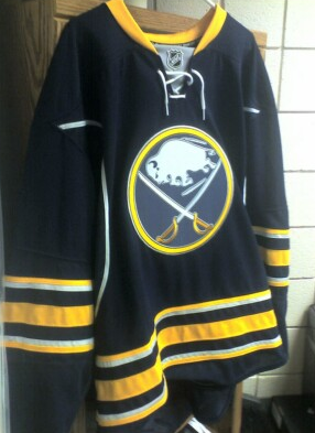
"Much better than the slug unis, but the extra silver stripes and the piping just seem unnecessary and obtrusive. The silver accents around the most important thing, the logo, don't bother me at all. The logo is as sharp and perfect as ever.
But there's some red flags about this picture. The quality for one. But I guess that would be the average camera phone quality. But the next thing that is suspect is the total lack of secondary markers. I mean, none? Really? That's disappointing. Then again, I'd happily take none over the slug leeching its way onto the shoulders of those jerseys.
Guess we'll see officially soon enough.
Still much better than our current pajamas, despite not being exactly what I'd hoped it would be."
I think it actually is a blank prototype and the logo material reflects the color a bit. I still say there is front numbers as well...
1 comment:
I still like it, even if it's not exactly what I had in mind. I love the laces, and the placement of the gray behind them.
It's just the gray (silver?) striping that seems off to me. But it's not a deal-breaker by any means.
I just hope there is a respectable shoulder marker. Vintage style numbers and letters would be nice, though I am rather fond of the typeface the Sabres use on their new unis for numbers and letters. In fact, I think it's the font they chose that makes their numbers on the front work, while other teams can't seem to get it to look quite right (Dallas aside, who found another solution).
So, mark me down for one of these babies!
Post a Comment