OK, not really, but we are wearing our thirds tonight in Toronto. Reason why? Toronto has white thirds.
Wednesday, December 31, 2008
Saturday, December 27, 2008
Booyah!!


As much as I hate to admit it, I do own an authentic RBK (2006-07) Roy home Slug jersey. Side-by-side, this jersey puts that one to shame. I also have an authentic RBK (2006-07) Pominville third (royal blue throwback.) This jersey looks far more modern, but still has an old-school feel. Sure, there are a few details that I would change (e.g., silver piping), but that does little to take away from the fact that this a great looking jersey.
Friday, December 19, 2008
That's more like it!
Sabres blanked the Kings 5-0 to move the thirds to 3-1 for the season. The play was ugly and the goals were anything but pretty, but damn did those jerseys still look good.
(Don't ask me what's going on it that pic.)
Thursday, December 18, 2008
Third Jersey, Game 4
Sabres will wear their thirds for the fourth time this season when they face the LA Kings tonight at 7:30.
Time to make amends for the last game in the thirds and, perhaps more importantly, for the last two (at least) home games. You're going to look the part, now play it, too!
Edit: I love seeing these ...
Go Sabres!
Wednesday, December 17, 2008
Buffalo Bisons new logo unveiling...
Yesterday the Buffalo Bisons unveiled the team's new logo which correlates with the team's new affiliation with the New York Mets.

I'm only speaking for myself right now and not the rest of the guys that contribute here but I have a few words that came to mind the instant I saw the logo:
Relevant. Symbolic. Exciting. Hey, that's not a goathead, not a slug, there is no doubt that it's a Bison!
I like the NYC skyline in front, behind the Queen City skyline. It is a little too busy in details with the Bison but forgiveable considering that it CLEARLY looks like a Bison. Too abstract, you get the slug, too detailed, goathead. It is very respectful of the new partnership and there is some real thought and care was put into the logo's creation. I had an instant positive connection to the logo and it seems very well received by the public. I wasn't a big fan of the sliding malnurished Minotaur in the green and red. This is a nice upgrade in both the color scheme and logo set. I am anxiously awaiting to see the uniforms in January. That could make or break the whole package. Hopefully the new duds include some classic Mets pin stripes and even possibly a different logo on the hats.
My hats off to Phoenix Design Works, the Bisons, and the Mets who put together a terrific new identity.
Friday, December 12, 2008
Ugh ...
I kinda wish that they had changed their jerseys before the third period. They definitely didn't earn the right to wear them in that period. All they needed was one more goal (*cough* ... Stafford ... *cough*) to reach 10,000 for the franchise. Would have been nice to do it in the original logo. But, alas, no.
Thursday, December 11, 2008
Third Jersey, Game 3
The Sabres look to extend two streaks tomorrow (Friday, 12/12) night against Toronto: (1) a three game win streak (quite the difference from the first two times that they wore the thirds), and (2) their two game win streak (2-0 starting with their debut) in their new thirds. Keep 'em going boys!
Friday, November 28, 2008
Two for two for the thirds!
The Sabres followed up a strong win over the Bruins in the third debut with another strong - maybe even "stronger" - win in the thirds against the Penguins tonight, 4-3.
Come on Larry, what more do you need to pull the trigger?!
Third jerseys, take two.
What better way could there be to followup a third-jersey debut win than to follow it up two days later with another. Do it boys!
This just looks right:
I must say, though, after two straight home games without the slug, it will be particularly painful to see it skate out against Montreal on Saturday. At least it won't be in our house (well, not until Monday.)
Wednesday, November 26, 2008
New thirds bring big win!
Oh yeah!!! Winning feels good and when you're wearing such a nice sweater, it looks good, too!
The five game losing streak is over and, hopefully, we just saw the future Sabres' uniform in its first victory!! Get 'er done, Larry!
Edit: I forgot to mention it, but Kevin Sylvester introduced the new jersey tonight by saying that we're getting "a sneak peek at the future ..." The hints keep mounting!

Tuesday, November 25, 2008
Classic Audio...
This was from back in 2006 and conducted by our friend Josh Brewster from Hockeytalk.biz. This was captured shortly after the Buffaslug was leaked out to the world and right around the 22,000 mark of angry Sabres petitioners...Drew made a good account here and speculation actually proved correct about the potential loss of Daniel Breire and/or Chris Drury.
Keep this in mind. Think back to your initial reaction to the leaked logo back in 2006 and then compare it to tomorrow night, Wednesday, November 26 2008 when the new updated third jerseys make their triumphant debut. Be honest with yourself and see if you actually have an emotional connection to the long standing identity of the Buffalo Sabres.
DREW CELESTINO VS. THE SLUG
JUST CLICK TO LISTEN!

Sunday, November 23, 2008
Reminder: Thirds to Premier Wednesday!!
Didn't want anyone to forget and decide to do the dishes rather than watch another potential Sabres' loss. Our new, throwback thirds will make their season premier this Wednesday, November 26th at home against Boston. Maybe it will be just the spark that this team needs to get things back on track!
*** FULL THIRD JERSEY SCHEDULE ***
DATE OPPONENT
Nov. 26 Boston Bruins
Nov. 28 Pittsburgh Penguins
Dec. 12 Toronto Maple Leafs
Dec. 19 Los Angeles Kings
Jan. 1* Toronto Maple Leafs*
Jan. 9 New York Rangers
Feb. 4 Toronto Maple Leafs
Feb. 6 Montreal Canadiens
Feb. 11 Ottawa Senators
Feb. 21 New York Rangers
Mar. 4 Montreal Canadiens
Mar. 12 Florida Panthers
Mar. 20 Philadelphia Flyers
Mar. 27 Toronto Maple Leafs
Apr. 6 Detroit Red Wings
Apr. 11 Boston Bruins
*Jan 1 is away game.
Friday, November 14, 2008
Visit SickJerseyBro.com
How can people laugh at themselves if they first can't laugh at someone else in a lame hockey sweater?
Check out a lunch room full of lunch boxes...
Potential White New Third Jersey ideas...
Alright, now that the Notre Dame alumni, collar popping, real estate developing, Bass Pro shopping, and Buffalo Sabres minority owning Larry Quinn has hinted to WGR radio at the possibility of a full time return and use of the new Third Logo for the team's 40th anniversary, there are a couple things to be aware of so we don't all jump off the cliff like mindless lemmings:
1. How convienient that WGR lost the audio archive of the interview.
2. Quinn only mentioned a switch surrounding the team's 40th anniversary.
3. Would the change go beyond that?
4. That means we need a new white jersey too!
5. Yes, we are now voting with our wallets and making the team more money.
So these comments on the radio was his subtle acknowledgement that this logo even with it's retail success DOES NOT HAVE iconic staying power and brand loyalty with its fans. We'll he has initiated a guerilla marketing campaign all over again.
Dave (Drtuka) and our own Chris (Carpandean) each have come up with very worthy ideas for a Sabres white jersey featuring the new updated third logo. I think if people get a look at these white concepts, they would be even more receptive to the return to the true blue and gold.
Carpandean:
Drutka:
Monday, November 10, 2008
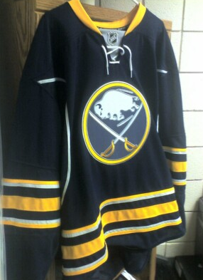
Third Jersey Has Arrived!!!
Well folks, Charlie and I scored us some Reebok Replica (also known as Premier) jerseys. To the folks on Icethetics who have questioned the authenticity of the seller from whom we got them, let me assure you - they're the real deal. Not counterfeits. Not forgeries. Real Premier jerseys. Same quality as my CCM vintage replica jerseys. So, if you're thinking of getting one from the seller in question, rest easy, his goods are the real thing. And he ships fast.
Anyhow, back to the review. Now, I personally dislike the Reebok Premier jerseys for their silk-screen shoulder logos. That was something that really turned me off to them last year, considering my old CCM replicas were priced the same, yet had fully embroidered shoulder markers. But, since the new Sabres third jersey has no shoulder markers to speak of, that's not an issue for me with this baby.
So call me a satisfied customer! If the talks are true and there's a matching white coming for 2010, count me in! This is what we've all been waiting for! And I couldn't be happier! Killer jersey!
On to the pics!!!


Saturday, November 8, 2008
Breaking news: Quinn says slug may die on 40th!!
I didn't catch the actual interview, but reports are popping up all over the place that before last night's game Larry Quinn stated that they are looking into making the original logo their primary again to correspond with their 40th!!
See, for example:
http://www.talkbuffalosports.com/showthread.php?t=3797
Quinn was on WGR today and Bulldog asked him about the new 3rd jerseys, and what could happen if they sell well, well received, etc..
Quinn confirmed that the team is in talks to potentially make the 3rds our PRIMARY jersey for 2010-11, which will be the 40th anniversary year.
he said the current slug jersey may be a 3rd jersey.
and:
http://forums.letsgosabres.com/index.php?showtopic=8905
Larry Quinn made some interesting statements before tonight's Sabres game regarding the franchise's jerseys.
Quinn said that the team is talking about returning to the traditional jerseys and logo permanently. This would likely happen in 2010-11, the franchise's 40th season.
He said the current slugs may be related into third jerseys if that happens. Quinn stated that it depends on how well the third jerseys sell.
Could the day that we have been hoping for (well, second behind that day where a certain cup is lifted by our players) be coming soon?!
Watching here to see if they post the interview.
Thursday, November 6, 2008
Sabres concept jersey ... with Sabres, not Slugs!
I meant to post this a while back, but real life has been a little demanding lately. Shortly before the new third came out, I started looking closely at the current jerseys. There is no denying that the current jerseys look good in spite of the slug. However, even with the abomination removed from the front, it's not perfect. So, I started making a list of what I like and do not like about them.
Likes:
Navy, gold, silver and white - a little more modern color scheme than just royal and gold, though I do like the traditional aspect of the royal.
Underarm "horns" - a unique, team-related detail that was subtly added into the jersey. If nothing else, I appreciate that detail.
Dislikes:
Missing key aspects of a hockey sweater - in particular, no waist or arm striping.
Rounded text - I'm a fan of the boxy, sharp-cornered text.
Slug - 'nough said. That's why we are here.
With that in mind, I started working on a design that I called "something old, something new." With the help of the folks over at SabreSpace, I ended up with the following:

Note: I did update the striping to match the new third jerseys after they came out and would use that same updated logo.
Edit per Drew's suggestion:

Wednesday, November 5, 2008
Congratulations to John Slabyk!
There are several people out there who don't know this but for over a year and a half talented freelance designer John Slabyk has been the Art Director for the Barack Obama campaign. I've known since July of 2007 when he first was mulling over taking the job as I was getting ready to launch SabresNotSlugs.com. Most people also know that ever since Fix the logo/Sabres Not Slugs began that both Drew and I strongly supported his well known creative efforts regarding the Buffalo Sabres and the New Blue and Gold project.
Now he is the Art Director for the President-elect of the United States of America. Not too bad!

Obviously this project was far more atmospheric than developing logo and uniform concepts! His visualization of the Obama campaign has been highly praised by peer designers and for good reason. The web design and layout no doubt played a subtle yet highly vital role in the campaign's success. In my opinion the overall Obama web experience was far more appealing, user friendly, focused, and easier to navigate compared to that of John McCain's web page. I know that web design certainly is not an indicator on how competent a president Obama may or may not be, but this design led for a far more effective platform to aid in the dissemination of Obama's message and other information to the American voters. It certainly was an underestimated difference maker in the campaign and election.
Nicely done! John you are a true talent! The sky is the limit now for you in your professional field. John has now forged a solid brand equity and can write his own ticket.
To relate this to the Buffalo Sabres, remember that this is the same guy who in 2003 received an audience with Larry Quinn and passionately inteviewed to be a part of "Change" in the Buffalo Sabres organization as they looked to rebrand with the return to the blue and gold. His ideas for the identity change were promptly dismissed by the team and was never given and feedback or follow up and they went forward(backwards) to release the ass-clownish slug logo as the new identity of the organization.
Thursday, October 30, 2008
Islanders trying to do something right?
In a trail of Chris(es), comes an interesting idea from the Islanders. I (Chris #1) direct you through Chris over at Icethethics to Chris over NYI Point Blank. He (Chris #3) reported today that the Isles are looking into using their new throwback third jerseys as their primary jerseys starting next season or, possibly, in 2010-11. What a great idea! Only thing that could make such an idea even better would be if the switch were to coincide with an important date for the franchise ... like, say, a 40th anniversary!
Monday, October 27, 2008
Are the Sabres Rebranding?
With the fantastic announcement that Buffalo will be hosting the 2011 World Junior Championship, I noticed another interesting detail. 
The real deal Sabres logo being used on the backdrop for the announcement is quite telling if you ask me.
Let's look at the facts. The Sabres are introducing a retro-style third jersey this year, bringing back their original and one true logo. When the players were introduced at the home opener, they all stormed out of those vintage crest-emblazoned curtains. We're a month into the season and the vintage logo still looks tremendous at center ice. And now the logo shows up on the backdrop for a major announcement in the hockey community.
Are the Sabres in the first stages of a rebranding? Are they taking steps towards salting the slug? Who knows. But a few big signs seem to be pointing to "yes."
So what do you think?
Tuesday, October 21, 2008
Former NY Islanders VP of Media Relations comments on "Fisherman" logo disaster.

This blog post comes from Chris Botta, former Media Relations Vice President of the New York Islanders who worked for the team when they launched the infamous "Fisherman" logo and jersey. You know it's bad when players and management knew with confidence they screwed up even before the jersey was officially released.
Link:
THE TALE OF THE FISHERMAN JERSEY Or, Shame and Mutiny on the Bounty
The idea of a new Islanders logo was immediately lost with the thought, “Hey, we should change the logo”! It could have been the coolest, most dynamic logo in the history of sports, and it still would have been a preposterous notion. And that’s without even getting into the nauseating wave at the bottom of the jerseys. Darius Kasparaitis and Travis Green were two of the lucky ones around to model it. When Darius saw the jersey, his reaction went something like this:
“Oh ma Gahd, we’re going to look like ####’in #####es.”
Tuesday, October 7, 2008
The Slug's cousin scores a mascot gig...
The Minnesota Wild, in a move pretty much more than unnecessary, have created a new team mascot.

It kind of looks like something that came to life and told you it will be totally groovy to jump out that 10 story window after you licked some LSD soaked blotter paper...
Wednesday, October 1, 2008
Something to be proud of this time...
You may remember there was no such feature with the inside scoop on the creation of the 2006 slug logo and jersey.
Frank, nothing personal, you created the slug and sorry Reebok handcuffed you the first time around back in 2006.
Thursday, September 25, 2008
CENTER ICE LOGO UPDATE
Well folks, get ready to come back down to earth. The word is that all teams introducing third jerseys will have their third jersey logos at center ice throughout the preseason as per order of NHL/Reebok in an effort to sell the new jerseys.
Come regular season, it's back to ol' Slugaroo.
I'll post more information, or official confirmation as soon as I get it. Maybe it's not true. Maybe the Sabres will stick with it longer than the preseason. Who knows.
But god dammit is this an infuriating low after yesterday's dizzying high.
Some words of wisdom to the NHL, Reebok, and Mr. Quinn - no one likes a cock tease.
--
UPDATE: Here is where the information came from. I've scoured WGRZ's website for an official post from Adam Benigini, but no luck. Take it for what it's worth.
http://www.buffalorange.com/showthread.php?t=146206
WGRZ Sports Adam Benigini,
The Buffalo Sabres had the 3rd logo down painted on the HSBC Arena ice and Mike Gilbert tells us that every team that owns a third jersey is going to have their alternate logo painted at center ice just for preseason, Carolina has the 3rd jersey logo painted at center on their home ice the hurricane warning flag with a triangle. When the regular season comes it will be back to the real logo.
Shame on him for calling the slug "the real logo."
Wednesday, September 24, 2008
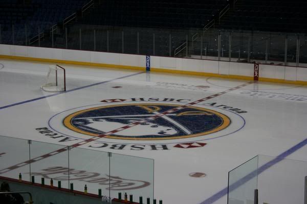
BREAKING NEWS: NEW 'OLD' VINTAGE LOGO ON CENTER ICE?
Those at HSBC and watching on Sabres TV might have noticed that center ice was blank during the September 20th uniform unveiling. According to some reports people at the open practice said that center ice in fact was now painted with the new vintage style logo.
Photos hopefully to follow very soon if this is true! And beatings to follow if it is not!
GOT IT! THANKS TO PETER AND KAREN! They were at the open practice and got this picture!

Here is another hi-res shot that was running around! This was originally taken by xDerekRx from the Sabresfans.com board.
Tuesday, September 23, 2008
Simply Awesome
Well, in the worlds of my good friend Charlie - there you go!
What a long and winding road it has been to get to this point. From the Celsius designs that had us all dreaming of how great a return to blue and gold could be, to the unfathomable disappointment we all felt when the slug leaked its way onto the internet. From the lies and empty promises of Larry Quinn regarding how we got to that point, to the revelations of Reebok using the Sabres as their unfortunate guinea pig in their ill-conceived (and ill-received) EDGE uniforms.
And here we are, staring at what the Sabres should have gone with from the beginning.
I for one could not be more pleased with what they've come up with here. I look forward to purchasing mine, and I hope everyone out there reading this does as well.
The 40th Anniversary of the Sabres is right around the corner. Personally, nothing would make me happier than the Sabres announcing these new jerseys as the team's ONLY home jerseys, with a road white to match, and the slug being salted once and for all. We can dream.
It's not that far-fetched. The first steps have already been taken.
Go Sabres.
Saturday, September 20, 2008
There you go!
All that is left is for fans to decide if you want to see the new 'old' look on the ice full time once again.
Be sure to contact the team and let them know how you feel!


Also notice the grey underarms of the new jerseys as well.

Wednesday, September 17, 2008
Two teams one shirt.
Now this isn't cool at all and completely illustrates that Buffalo's two professional sports logos are too similar thanks to the slug logo and it's unoriginality.
It's on eBay right now...go win it, then burn it.
Saturday, September 13, 2008
Another third jersey picture...
Another photo is floating around the internets and shows that the Sabres crest matches the rest of the jersey...

Friday, September 12, 2008
Snack time.
I felt compelled to vandalize my mid morning snack at work on this fine Friday. Can't you guys see the Sabre sword handle and sabre blade inside my banana? Notice how it doesn't make a letter 'B' shape at all. I can't help but totally think of speed and power when I look at my special charging banana. It's so obvious. Too bad for the poor guy I was hungry. His speed and power was no match for my apetite so I skinned him alive and ate him. 
With the verification of the new thirds being the real deal, I am very much looking foward to fan reaction and the true feelings to come out...the ownership can't ignore that this time.
The team caught a lucky break and took advantage of winning and fan loyalty to cash in on a terrible look...and now they are set to cash in by fixing it.
Fans were finally waiting for the team to get it right. All that would be left is to update the whites (which Dave Rutka has done as a preview, I'll beg him to do one with front numbers!) and we are off again as a classy looking franchise. Imagine the vintage logo style on center ice. It makes too much sense.
You guys can make it happen!
Monday, September 8, 2008
DRutka with some more previews of the leaked Third jersey...
There are very nice! My only hope is that the team uses new pants for the third jersey instead of using the current ones like they did for the 2006 season. The result was a bush league non-matching royal blue jersey and navy blue pants, navy helmet, and royal blue socks during the 2006 season.
And I still am pretty sure that front numbers will be on the jersey...That picture was simply an incomplete jersey missing lettering/numbering/shoulder elements. The different color between logo and crest is most likely the tackle twill material of the logo reflecting back some color where as the RBK Edge material (or whatever the hell it is now) does not.


Sabres New Third Leaked?...or faked?
I'll pretty much agree with what Drew said on this one...
"Much better than the slug unis, but the extra silver stripes and the piping just seem unnecessary and obtrusive. The silver accents around the most important thing, the logo, don't bother me at all. The logo is as sharp and perfect as ever.
But there's some red flags about this picture. The quality for one. But I guess that would be the average camera phone quality. But the next thing that is suspect is the total lack of secondary markers. I mean, none? Really? That's disappointing. Then again, I'd happily take none over the slug leeching its way onto the shoulders of those jerseys.
Guess we'll see officially soon enough.
Still much better than our current pajamas, despite not being exactly what I'd hoped it would be."
I think it actually is a blank prototype and the logo material reflects the color a bit. I still say there is front numbers as well...
Wednesday, September 3, 2008
Your new Buffalo Sabres Owners...
Wow, what a roller coaster of a day here. From the excitement from the hint of the Sabres doing something right with the new third jersey to finding out Larry Quinn is now a minority owner of the team. He technically isn't a controlling interest but soon enough, Tommy G is going to cash in his chips and Larry Quinn and DiPofi can each or seperately step up with the controlling stake in the team...especially if all of Larry Quinn's developing projects come to full fruition. I'll try to reserve judgement for now. This might not be a big deal either...granting minority ownership could merely be a part of of a restructuring of these two executives' compensation package for being Buffalo Sabres management.
A suggestion this here hamilton dropping thousandaire would like to make is to let loose some of that cash and raise your self-imposed salary cap.
So there you go. I have to go clean the vomit off my monitor now.
Front laces...
As I expected the Sabres teased us on their splash page to the website with an image of the new third jersey sporting some lace tie ups.
Expect the front numbers too when we see the rest...the only question remains is whether the sleeves will somehow be trimmed in silver accents.
Wow...I'm actually getting excited to buy a Sabres jersey for the first time in 12 years.
Note the team's 40 year anniversary is approaching...could we possibly see this as the team's primary jersey by then? Hopefully...if Larry Quinn has a pulse and will realize it's good for the team's long term margins, he'll deliver some class back into the team's identity that he took away and make this jersey a full time look and get rid of the cartoony shit streak.
Wednesday, July 30, 2008
What I expect from the Sabres September 20th...
Today on Icethetics, we saw a big scoop as a photographic sampling of several NHL teams' possible new third Jersey logos was put up on his great site. I love the internets.
It seems like with any leak you are usually guaranteed a few things. Sketchy details from the 'leaker', shitty pictures, and tons of speculation. This is no different as included was a shitty picture of the Sabres and a slightly different than we remember vintage logo.

Notice there are indeed silver elements in the sabre handle and bordering the circular part of the crest. Well I have been thinking long and hard and truly believe that this picture as bad as it is, to be authentic.
I also confidently expect the following elements to be added:
1. Dark Blue to match the current jerseys (not a big surprise for most)
2. Front Numbers
3. Front tie-up laces
This will be introduced as an Alternate jersey. Note it cannot be called a vintage uniform anymore because of the distinctive elements not present in the royal blue 1970-1996 version or the 2006 Royal blue alternate.
My take on the design:
The Sabres know full well there will be a large number of vintage logo/uniform enthusiasts somewhat skeptical of the new RBK Edge system and its well publicized issues compared to its air-knit predecessor. So their answer to appeal to the masses was to design "vintage style" uniform. The old royal blue classic uniform is a bit dated and in my opinion, not as attractive as the white classic uniform. So they created a new look very respectful of the classic design but contains new elements that would persuade fans to make a trip to the merchandise stand, Sabres store, or NHL shop.
EDIT: Mad props to Dave (user DRutka) from the Sabres board putting together a very solid high resolution idea of what to expect.

 I think this is pretty damn close to the real thing. Nice job Dave!
From a SabresNotSlugs perspective:
The darkening of the jersey to match the current HSBC "paint job" and and potential popularity of the jersey could be the beginning of the end of the slug as the primary jersey. We all heard the talk about not making the circular logo work, and now all of a sudden we are going to be skating around in circular "vintage style" glory. If the team got this forthcoming design right, fans won't want to see the team wear this for 15 games all over again like in 2006. We saw how great an RBK Edge white jersey would look in the winter classic. We now know the circular logo not working crap was indeed a line of crap...the success and popularity could parlay into a logo mutiny leading to the demotion of the slug to an alternate jersey/logo or the removal of it all together.
So read this and hold onto this idea...if you wind up loving this new look coming down the road...don't just sit there and say to yourself how you really like the vintage style jersey on the ice and in the arena full-time but the Sabres will never do anything about it. Do something about it this time and let the team, news, and local TV know about it!
Thursday, July 24, 2008
Sleeping with the enemy...
Dear God in heaven, Hell No! This is just about as bad as it gets for me...Somewhere out there, in Cheektowaga little Timmy rests his head on these guys every night.
The only thing worse I can think of is selling a Hitler Bobblehead.
Part of the embarassment I have for this logo is looking how even more ridiculous the slug looks in the merchandise that the team is pushing along with it. Is there really a die hard fan out there that would really buy this for themselves or their kid?
I guarantee a studly bachelor(ette) will not be getting one scrap of ass rocking the slug sheets. 
Friday, July 11, 2008
The Iowa Chops and a charging...squeeling...stylized...Pig.
Ok...My wife grew up in Indianola, IA a quick shot away from Des Moines so I was mildly interested in seeing the Iowa Stars re branding under new affiliation with the Anaheim Ducks...I wound up feeling embarrassed for her.
When I told her and showed her at work I received a text back "Not now, the cable guy is here running some wire and then the mailman is showing up to deliver a special package and the milkman plans on helping out."
Weird...we don't get milk delivered. But I'm sure she'll hate the new logo too.
This is brutal. Howdy Slug pig hippo. He's missing the apple in his mouth too.
Ok I still might ask the father-in-law to mail out a hat though. He sure does know how to grill up a thick kick ass pork chop from the Hy-Vee.
Spanky Ham up there was kind of growing on me in a lovable porky dork kind of way, a reminder of myself growing up a husky pants wearing chubster. The logo does not at all represent the tenacity that Schlegel Sports insist that the logo represents. Maybe C.H.O.P.S is this instead just wrapped up cleverly in Schlegel's corporate "Steak house" font? Unwanted Association Alert!

Then again Schlegel Sports is based out of Texas...Steers and well...you know. How bold or crazy is an organization who SPECIALIZES in SPORTS MARKETING AND MANAGEMENT could be so off and then boast in pure confidence that people in Iowa will like it. They might not like it but now you have the attention of a lot more people and from what I learned about the Sabres slug phenomenon: as long as the CHOPS are a decent on ice product, they will move merchandise and they will pull this logo off. But don't you think that Iowans want to be known for more than just the agriculture? Granted they are great hardworking people in and out of their big ticket industry but I'm sure the climate of the state as a whole is sensitive, similar to Buffalo in that both would like to shed their respective "Hick Farmer" and "Chicken Wing" stereotypes. But with Wells Fargo arena becoming the "Pig Pen" or "Meat Locker" and throwing salmonella infested pork chops on the ice for hat tricks, they have positioned themselves to further monetize the stereotype that is acutally is the state's huge 12 Billion dollar pork industry.
Seriously PETA is headquartered here in Norfolk and I don't think they would be down with chucking pork pucks on the ice. They are a PR pain in the ass.
I could accept the "menacing pig" if he was actually menacing...like this concept from one of the members of Sportslogos.net...
I mean I can understand. My now hometown AHL Norfolk Admirals definitely "piggy" backs its name and appeals to the home of the worlds largest Naval base and large military community. They have their own team identity with the city even though they have changed leagues and affiliatation multiple times over the last decade. It made sense...but in this case, I think the Chops should have looked for something else.
So far the polls on the Des Moines Register do not reflect such approval in being associated with a Delicious piece of grilled mammal flesh.
The current tally as of Friday (today)
Love it 32% (571 votes)
Don't care 10% (172 votes)
Hate it 58% (1045 votes)
Total Votes: 1788
Taking a page right out of the Sabres marketing playbook...let all of the negative attention somehow be spun into the most successful guerrilla marketing campaign in the history of the universe and it will translate into wide spread awareness across demographics and cash at the box office and merchandise stands...regardless of the ridicule it may bring the city, team, and State of Iowa. I'm certain the Iowa Chops' launch is well-backed, kick-backed, and buffered by the Iowa Pork Producer Industry/Council. Remember, people in your focus and test groups agree with your identity for the team doesn't mean rest of the mob will "buy" it...but then again I could be wrong and I probably am if people haven't learned their lesson. Most of the hockey nation is talking all about the minor league Iowa Chops right now in the middle of July.
So "brand awareness" no longer needs to be marched together with positive public approval to successfully validate a logo and brand identity as a success.
So am I wrong in this conclusion? Has marketing strategy gone from delivering well conceived long lasting time tested iconic logos and identities to creating something either just good or bad enough to last 5-10 years, all so they can repackage the bullshit and cash in again on a new look and bring home more uh...bacon? Looks like it to me.
Subscribe to:
Posts (Atom)