I felt compelled to vandalize my mid morning snack at work on this fine Friday. Can't you guys see the Sabre sword handle and sabre blade inside my banana? Notice how it doesn't make a letter 'B' shape at all. I can't help but totally think of speed and power when I look at my special charging banana. It's so obvious. Too bad for the poor guy I was hungry. His speed and power was no match for my apetite so I skinned him alive and ate him. 
With the verification of the new thirds being the real deal, I am very much looking foward to fan reaction and the true feelings to come out...the ownership can't ignore that this time.
The team caught a lucky break and took advantage of winning and fan loyalty to cash in on a terrible look...and now they are set to cash in by fixing it.
Fans were finally waiting for the team to get it right. All that would be left is to update the whites (which Dave Rutka has done as a preview, I'll beg him to do one with front numbers!) and we are off again as a classy looking franchise. Imagine the vintage logo style on center ice. It makes too much sense.
You guys can make it happen!
Friday, September 12, 2008
Snack time.
Tuesday, September 4, 2007
Sabres RBK Edge jersey unveiling...
In what should be a rather non-spectacular event without the hacking of www.Sabres.com to unveil a secret jersey photo, the team will release the new RBK Edge slug sweaters to the public on September 15th.
That is terrific. Are fans out there who do like the jerseys going to be persuaded to fork over either $110 or $250 dollars for another jersey...in consecutive years...and another jersey that is essentially no different than what people purchased last year? It makes me wonder why the Sabres unveiled the new logo last year, a full year before the manadory NHL change to the RBK Edge jersey. The Anaheim Ducks had a decent reason, they fell under the new ownership of Henry Samueli while the Walt Disney Company held the rights for the Mighty Ducks name and uniforms. To keep as an identity, Samueli would have to purchase licensing from Walt Disney.
But I would personally purchase a home and away slug if they tweaked the logo a bit...
At least there is a Sabre now along with the stylized charging yellow phallace.
And remember there will NOT vintage thirds will be avaiable until at least 2008-2009. If indeed the slug is to stay...please hold off and WAIT for the vintage to come back in 2008-2009. I'm holding on to the idea that MAYBE for the NHL game at the Ralph vs. the Penguins the Sabres can rock the vintage. But it's more than likely Larry Quinn would have had to ask the NHL permission for that at least seven years ago. Fire up the De Lorean and Flux Capicitor...
Anyone else think this will be the number one selling jersey in the NHL again this season? [crickets]
BUT be mindful of the rumors having the vintage be darkened to match the blue of the current uniforms because of what I have heard mumbled as inconsistencies in the royal blue fabric stock to produce the jerseys and uniforms. That's a mindbender...you have that iconic look for 20 years and all of a sudden people can't make royal blue stay royal? Whatever...they just want to save money and not have to buy matching helmets, socks, and pants for the team.
Also the new RBK Edge jersey will be available for pre-order...I'll do my part for all the slug huggers out there and lock in my pre-order of ZERO jerseys.
Friday, August 31, 2007
1 Million Dollars for the Canucks' new look?
Rumors only said the price tag for the Sabres awful logo design and implementation was tagged at only $200,000 dollars (and that included putting the charging angry yellow penis on the HSBC scoreboard).
For Canuck fans I think the jersey looks pretty good. The wordmark actually helps out the Orca in my eyes, but the wordmark itself is way too big in typeface and no doubt will crowd the jersey of Captain Markus Naslund. But after watching a day full of college football teams with awkward piping and wordmarks on the front of the jersey, I think NHL designers are trying to follow suit and make this the norm in design from now on.
Reactions for the latest RBK Edge design are again...Mixed.
Really only time will sort this out but if the Canucks play well, just like the Sabres last year, will only boost sales and provide a rather false validation for the look and logo.
So to keep that from happening, if you hate it, DON'T BUY IT and stick to your guns! It doesn't make you any less or more of a fan if you purchase it or not as long as you root for the team and put your butt in the seats.
But if the majority of fans approve or not of the new look, 1 million dollars to spend on a logo is rather absurd.
I always love a good mockery. Thanks to Chirs from the NHL Tournament of logos for putting up this redundant beauty of redundancy.
Pfizer, the guy who is now in the business of logo genetics and breeding...and brought us this very humorous "mating" of all Vancouver's logos. Notice how the Orca has evolved into a skating machine and is toasty warm wearing Johnny Canuck's beanie.
He did the same thing for the Sabres as well at my request...
Thursday, August 30, 2007
Primitive RBK Edge uniform designs...
RBK initially designed the uniforms for the 1975 crap cult movie smash "Rollerball" as rollerballin' thespians wanted a performance enhancing fabric while throwing their elbows during filmaking. Said James Caan of the jerseys, "The material is lighter and it doesn’t absorb water like the other jerseys we were going to use, so you don’t feel like you have 10 pounds on your back by the end of shooting for the day. You feel faster.”  Take a look at the genesis of cutting edge fabric technology...A double super secret peak at the RBK drawing board.
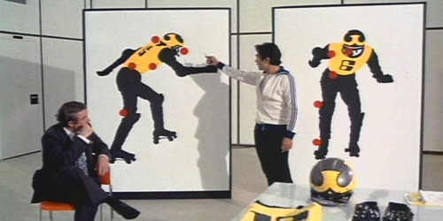
And now the finished product in action. Check out that form fitting goodness: