As scooped on the Sabres board there is an interesting link being passed around to a store selling what they call the January 1st, 2008 special edition jerseys for the Winter Classic. It's from a company called GreatSkate. Check it guys and email me @ info@SabresNotSlugs.com or comment if you have any more info. Thanks!!
Product Information:
Special Edition for January 1st, 2008
Winter Classic Clothing Line From RBK
Cheer on the NHL and watch the Buffalo Sabres VS. the Pittsburgh Penguins in this onetime outdoor game.
Order now for November Delivery. Make a Great Holiday Gift!
RBK Vintage Sabres Jersey - White
Buffalo Sabres Logo on front and Shoulders - As Pictured
Air Mesh w/Poly knit neck trim
Tackle Twill Applique w/emb.
As Pictured Above
Sizes Small - X-Large
Of course and as usual, there has been no confirmation by either the NHL, the Buffalo Sabres, or RBK International.
The only thing I didn't ask if Pittsburgh would be wearing a throwback as well. There is no indication of that on their products list on the website either...
****UPDATE****
The company's customer service told me when I asked about the uniform for the game "Absolutely yes...white vintage."
And he replied when I asked about an official announcement from any organization and he replied "They haven't announced it yet but we definitely know about it...wanna get in your pre-order today?"
He also said that the jersey is made by RBK but is NOT in an RBK Edge cut uniform. It will simply be the same style cut as our alternate thirds from last year. According to them, there will be no NHL emblem on the neck. It is a replica jersey that they are selling as well, NOT the authentic.
***************
Well I hope this is true because for me, this may be the big step and finally a hint that the Sabres got the clue that the vintage is the more visually appealing and more profitable look long term jersey to go with. Hopefully they will realize that, get smart, make the vintage the primary logo again and keep the slug as the third to not generate dissent among fans who spent good money on the current look.
This is the organization's chance to make right and make the vintage jersey the number one selling NHL jersey in the league for next season when it comes back. Which I hope they already thought of...using the slug in the old bait and switch move in favor of the vintage.
People have an emotional connection to that vintage look way more than for the slug. Even non-Sabres fans respect the vintage look of the Sabres. Just like buying a new car, if you get emotion involved, you get higher sales and more profit.
Now then...just a thing for the Sabres owner, Managing partner, Creative Services Director, and Marketing department to keep in mind as they are now in the process of "modifying" the third jersey for its re-introduction next season.
DO NOT DARKEN THE BLUE OF THE JERSEY. Don't be cheapskates and just buy some lighter blue pants and helmets that match. The rumor out there is that there are inconsistencies in the blue fabric that require the change...well if Vancouver can wear a royal blue color with their new Edge jerseys, then the Sabres' version of that shouldn't be hard to match.
If you darken the jersey anyway, please don't use that color fabric inconsistency line as an excuse. If you want to darken it to make it the primary uniform and logo again and match the outfitted color scheme of the HSBC arena and it makes that transition back to the classic logo more cost effective, then I'm all for it!
Wednesday, October 24, 2007
Sabres white vintage jerseys to be worn at the Winter Classic?
Wednesday, October 3, 2007
RBK Edge "template"
Now that we have the whole package available to look at, we can now see how RBK ran out of creative steam when redesigning the NHL's uniforms.
It's an obvious look at the RBK templates, styling, and design bleeding over on to other teams. It's lame and annoying that these teams have to share each others design and look and makes me think that RBK's grand research and developement stressed heavily on teams drawing designs out of a RBK Edge water repelling top hat.
Edmonton and Florida can enjoy a custody battle over their Half sleeves, and vertical piping.
Moving on to Ottawa and Pittsburgh...Notice their cuffs. "Weaksauce" as they say on the urban dictionary.


Function over form here and the function sucks right now...but that should change soon and hopefully before player safety becomes an issue.
At least the NHL or RBK are beginning to listen to its players and RBK is fixing the problem regarding the wicking of moisture into gloves and skates...This after all is the NHL and RBK's hopeful cash cow and they simply don't have the money or public relations wiggle room of the NBA to handle its own version of the New Ball controversy.
Article: New sweaters here to stay
"The biggest issue focused on the water resistant coating on the fabric of the sweaters. It was designed to keep moisture out.
It did that, but also trapped the moisture in which led to soggy equipment and unhappy hockey players.
To correct that problem Reebok says it has developed a treatment that permits sweat to escape through the fibers, yet still manages to stay reasonably dry.
This new sweater is being shipped to teams around the league, with the Pittsburgh Penguins and Reebok's spokesman Sidney Crosby likely to debut the modifications as early as Friday.
Despite the public outcry from the game's fighters, the NHL doesn't see the need to alter the design to accommodate their needs, other than to further investigate whether the sweater's tie-downs have to be improved."
Friday, September 28, 2007
Here's how you fix it...
Sorry to steal your title, Chris!
"It was easier to start from scratch," said Frank Cravotta, Sabres director of creative services. "When your old logo is such an icon, it's hard to redo it."
This was a quote taken and recorded by the Buffalo News at some point last season during the logo leak. What bothers me most is that there were over 80 logos to choose from and the slug is what RBK and the Sabres thinktank settled for.
So in regards to that quote I would disagree. I could not imagine the current logo's merchandise ever outselling the examples below if a new logo is professionally done to mirror what regular joes have done with paint and photo shop...![]()
![]()


Or if someone makes it into the real thing...
And here...


Thursday, September 13, 2007
RBK "Edging" the Rochester Americans...
Why?
Adding the shoulder star and if they will still have the sleeve numbers with all that piping in way makes this uniform too crowded.
Wednesday, September 12, 2007
New Maple Leafs uniforms (and Marlies too)
Although it looks like Under Armour made this jersey, Toronto still protects their house with a very simple, somewhat plain look...but that works for Detroit and it works for me as well. Maybe Leafs guys were too afraid to change the uniform...I'm not sure the uni will fly with Leaf fans. 
Tuesday, September 4, 2007
Sabres RBK Edge jersey unveiling...
In what should be a rather non-spectacular event without the hacking of www.Sabres.com to unveil a secret jersey photo, the team will release the new RBK Edge slug sweaters to the public on September 15th.
That is terrific. Are fans out there who do like the jerseys going to be persuaded to fork over either $110 or $250 dollars for another jersey...in consecutive years...and another jersey that is essentially no different than what people purchased last year? It makes me wonder why the Sabres unveiled the new logo last year, a full year before the manadory NHL change to the RBK Edge jersey. The Anaheim Ducks had a decent reason, they fell under the new ownership of Henry Samueli while the Walt Disney Company held the rights for the Mighty Ducks name and uniforms. To keep as an identity, Samueli would have to purchase licensing from Walt Disney.
But I would personally purchase a home and away slug if they tweaked the logo a bit...
At least there is a Sabre now along with the stylized charging yellow phallace.
And remember there will NOT vintage thirds will be avaiable until at least 2008-2009. If indeed the slug is to stay...please hold off and WAIT for the vintage to come back in 2008-2009. I'm holding on to the idea that MAYBE for the NHL game at the Ralph vs. the Penguins the Sabres can rock the vintage. But it's more than likely Larry Quinn would have had to ask the NHL permission for that at least seven years ago. Fire up the De Lorean and Flux Capicitor...
Anyone else think this will be the number one selling jersey in the NHL again this season? [crickets]
BUT be mindful of the rumors having the vintage be darkened to match the blue of the current uniforms because of what I have heard mumbled as inconsistencies in the royal blue fabric stock to produce the jerseys and uniforms. That's a mindbender...you have that iconic look for 20 years and all of a sudden people can't make royal blue stay royal? Whatever...they just want to save money and not have to buy matching helmets, socks, and pants for the team.
Also the new RBK Edge jersey will be available for pre-order...I'll do my part for all the slug huggers out there and lock in my pre-order of ZERO jerseys.
Thursday, August 30, 2007
Primitive RBK Edge uniform designs...
RBK initially designed the uniforms for the 1975 crap cult movie smash "Rollerball" as rollerballin' thespians wanted a performance enhancing fabric while throwing their elbows during filmaking. Said James Caan of the jerseys, "The material is lighter and it doesn’t absorb water like the other jerseys we were going to use, so you don’t feel like you have 10 pounds on your back by the end of shooting for the day. You feel faster.”  Take a look at the genesis of cutting edge fabric technology...A double super secret peak at the RBK drawing board.
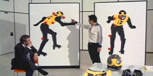
And now the finished product in action. Check out that form fitting goodness: