The 'little birdies' are already creeping out and we already have some more details on the forthcoming Buffalo Bills uniform. One detail that is frustratingly disappointing is the mention of navy blue trim. I do not understand why they thought royal blue with navy trim would work when navy blue with royal trim didn't work in the last disaster. Someone from One Bills Drive please email me on that if you ever see this blog, I would like a dialog with you! Why not trim it in nickel or something and drop the navy blue all together!?!?
The update comes from www.uniwatchblog.com Paul Lukas who is the authority on this stuff and his source described the new uniforms.
"These new Bills uniforms are clearly modeled after the later Simpson-era design, including the white helmet, but they’ve been updated to include a tiny amount of navy blue trim.
In my opinion, the navy blue is probably not necessary, but the uniforms do look quite good, and any sort of socks are an upgrade in my book. I wish they would update that darn logo, though. I’ve always preferred the solid red standing buffalo to the blue leaping buffalo, but I don’t think the retro logo works seamlessly with this new set, either. It is what it is. An upgrade, for sure."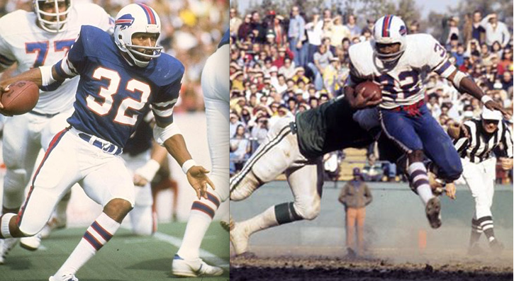
Thursday, February 10, 2011
Buffalo Bills new uniform update.
Monday, February 7, 2011
Well, It's Official
Well folks, it's official. The Quinn/Golisano era is over, and the Pegula era is forthcoming. From all accounts, it sounds like it's going to be a great new chapter in the history of the Sabres and I for one am really excited about it.
But with new owners can sometimes come new uniforms. And that's a prospect I dread. The Sabres have FINALLY gotten their uniforms and logo right for the first time since they changed to red and black back in 1996. The thought of yet another change is just unbearable. The logo and uniforms they currently wear are all the fans could ever ask for (and more!).
But... that's not to say we couldn't tweak a few things, right?
My main point of contention is the "sweat stain" gray patches in the underarms. They serve no purpose, and while harmless on the blue jerseys, look horrible on the whites, which are among the classiest in the league, by far. They do live up to their derogatory namesake. They look like dark pit stains. And that's just not cutting it. So, first tweak: lose the gray pit stains. Blue and white will suffice.
My second issue is the continued use of the old slug jersey number font on the helmets. Nit-picky, sure. But it's inconsistent with the jersey number style and only serves as a reminder to the slug era, which is best left forgotten.
Getting into more nit-picky territory are the silver stripes inside the gold stripes on the sleeves and waist of the jerseys. This is one modern update that I don't really mind, but if it went away I wouldn't complain either. They do break up the striping a bit, but I don't know that they're really necessary.
These issues aside, I have no complains and nothing but praise, to be honest.
So, let's hope Mr. Pegula is like-minded and leaves well enough alone. And boy let's hope he's not a fan of the slug...
Tuesday, November 30, 2010
Dear Mr. Pegula,
If you are in fact intent on purchasing our beloved Buffalo Sabres, all we fans ask is that you never, ever allow the slug to return, and that our logo remains unchanged from here on out. Thank you sir.
Monday, October 25, 2010
Slug is still around...for good or not?
This is absolutely ridiculous. Right now as I understand it and hearing some off the record stuff, the 40th jersey is just a one year deal and what I was hoping not to happen most likely will...the slug as a possible third jersey in 2011-2012.
What is even more ridiculous is the Sabres director of Public Relations referring to the logo by its most affectionate nickname. Smooth move...you should have made your intentions for the identity of this team very clear back in September.
“We never said the ‘slug’ was going to go away,” said Michael Gilbert, Sabres director of public relations. “It’s on the scoreboard and elsewhere in the arena.”
Why such a vague quote? Can't he elaborate further? Why WOULDN'T it eventually go away?
I can only hope the 'slug' is only still around while advertising deals already in place that may have included use of the slug logo eventually expire and then...finally that stupid ass logo will too FOR GOOD.
Please tell Frank Cravotta to start cobbling a new slug free scoreboard and locker room board!
Saturday, October 9, 2010
It's the little things that matter ...
Trying to ignore the mess that happened in the new 40th jerseys tonight in Buffalo, I turned my attention to the Pirates. They've been de-slugged:
Wednesday, October 6, 2010
NY Times article...Quinn points at RBK...Reebok...Re-whatever for the Slug.
For me this kind of puts a bit of a final stroke on everything the last three years. At the moment, the new 40th Anniversary uniform is only going to be used this season (which could eventually change) but be sure and confident that the slug will never be used to represent the Buffalo Sabres again. From that, the fans, and maybe even the team who seemed glad the slug is gone, can move forward to bigger things.
Friday, October 1, 2010
Wow
I don't know about you guys, but I've caught some Sabres pre-season games on TV and online, and all I can say is "WOW!" Those whites look amazing on the ice! I can't wait to see the throwbacks in action now!
But someone send Jonas Enroth the memo: get that slug off your mask.
Can't wait for the season to start! Let's go Buffalo!