Thursday, September 25, 2008

CENTER ICE LOGO UPDATE

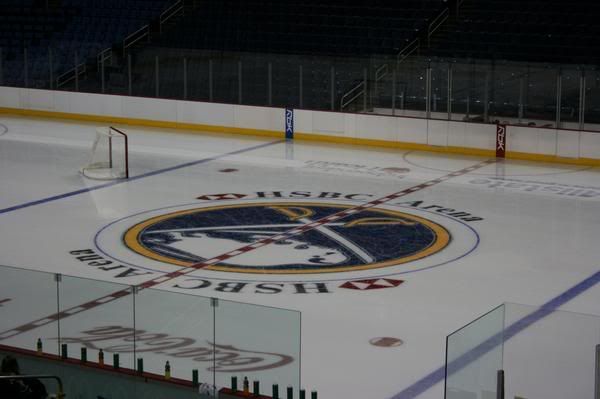
Well folks, get ready to come back down to earth. The word is that all teams introducing third jerseys will have their third jersey logos at center ice throughout the preseason as per order of NHL/Reebok in an effort to sell the new jerseys.

Come regular season, it's back to ol' Slugaroo.

I'll post more information, or official confirmation as soon as I get it. Maybe it's not true. Maybe the Sabres will stick with it longer than the preseason. Who knows.

But god dammit is this an infuriating low after yesterday's dizzying high.

Some words of wisdom to the NHL, Reebok, and Mr. Quinn - no one likes a cock tease.

--

UPDATE: Here is where the information came from. I've scoured WGRZ's website for an official post from Adam Benigini, but no luck. Take it for what it's worth.

http://www.buffalorange.com/showthread.php?t=146206

WGRZ Sports Adam Benigini,

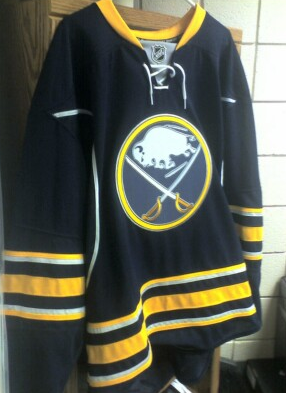
The Buffalo Sabres had the 3rd logo down painted on the HSBC Arena ice and Mike Gilbert tells us that every team that owns a third jersey is going to have their alternate logo painted at center ice just for preseason, Carolina has the 3rd jersey logo painted at center on their home ice the hurricane warning flag with a triangle. When the regular season comes it will be back to the real logo.


Shame on him for calling the slug "the real logo."

Wednesday, September 24, 2008

BREAKING NEWS: NEW 'OLD' VINTAGE LOGO ON CENTER ICE?

Those at HSBC and watching on Sabres TV might have noticed that center ice was blank during the September 20th uniform unveiling. According to some reports people at the open practice said that center ice in fact was now painted with the new vintage style logo.

Photos hopefully to follow very soon if this is true! And beatings to follow if it is not!

GOT IT! THANKS TO PETER AND KAREN! They were at the open practice and got this picture!

Photobucket


Here is another hi-res shot that was running around! This was originally taken by xDerekRx from the Sabresfans.com board.

Tuesday, September 23, 2008

Simply Awesome

Well, in the worlds of my good friend Charlie - there you go!

What a long and winding road it has been to get to this point. From the Celsius designs that had us all dreaming of how great a return to blue and gold could be, to the unfathomable disappointment we all felt when the slug leaked its way onto the internet. From the lies and empty promises of Larry Quinn regarding how we got to that point, to the revelations of Reebok using the Sabres as their unfortunate guinea pig in their ill-conceived (and ill-received) EDGE uniforms.

And here we are, staring at what the Sabres should have gone with from the beginning.


I for one could not be more pleased with what they've come up with here. I look forward to purchasing mine, and I hope everyone out there reading this does as well.

The 40th Anniversary of the Sabres is right around the corner. Personally, nothing would make me happier than the Sabres announcing these new jerseys as the team's ONLY home jerseys, with a road white to match, and the slug being salted once and for all. We can dream.

It's not that far-fetched. The first steps have already been taken.

Go Sabres.

Saturday, September 20, 2008

There you go!

All that is left is for fans to decide if you want to see the new 'old' look on the ice full time once again.

Be sure to contact the team and let them know how you feel!


Also notice the grey underarms of the new jerseys as well.


CONTACT THE BUFFALO SABRES!

Wednesday, September 17, 2008

Two teams one shirt.

Now this isn't cool at all and completely illustrates that Buffalo's two professional sports logos are too similar thanks to the slug logo and it's unoriginality.

It's on eBay right now...go win it, then burn it.

Saturday, September 13, 2008

Another third jersey picture...

Another photo is floating around the internets and shows that the Sabres crest matches the rest of the jersey...


Friday, September 12, 2008

Snack time.

I felt compelled to vandalize my mid morning snack at work on this fine Friday. Can't you guys see the Sabre sword handle and sabre blade inside my banana? Notice how it doesn't make a letter 'B' shape at all. I can't help but totally think of speed and power when I look at my special charging banana. It's so obvious. Too bad for the poor guy I was hungry. His speed and power was no match for my apetite so I skinned him alive and ate him.


With the verification of the new thirds being the real deal, I am very much looking foward to fan reaction and the true feelings to come out...the ownership can't ignore that this time.

The team caught a lucky break and took advantage of winning and fan loyalty to cash in on a terrible look...and now they are set to cash in by fixing it.

Fans were finally waiting for the team to get it right. All that would be left is to update the whites (which Dave Rutka has done as a preview, I'll beg him to do one with front numbers!) and we are off again as a classy looking franchise. Imagine the vintage logo style on center ice. It makes too much sense.


You guys can make it happen!

Monday, September 8, 2008

DRutka with some more previews of the leaked Third jersey...

There are very nice! My only hope is that the team uses new pants for the third jersey instead of using the current ones like they did for the 2006 season. The result was a bush league non-matching royal blue jersey and navy blue pants, navy helmet, and royal blue socks during the 2006 season.

And I still am pretty sure that front numbers will be on the jersey...That picture was simply an incomplete jersey missing lettering/numbering/shoulder elements. The different color between logo and crest is most likely the tackle twill material of the logo reflecting back some color where as the RBK Edge material (or whatever the hell it is now) does not.


Sabres New Third Leaked?...or faked?


I'll pretty much agree with what Drew said on this one...

"Much better than the slug unis, but the extra silver stripes and the piping just seem unnecessary and obtrusive. The silver accents around the most important thing, the logo, don't bother me at all. The logo is as sharp and perfect as ever.

But there's some red flags about this picture. The quality for one. But I guess that would be the average camera phone quality. But the next thing that is suspect is the total lack of secondary markers. I mean, none? Really? That's disappointing. Then again, I'd happily take none over the slug leeching its way onto the shoulders of those jerseys.

Guess we'll see officially soon enough.

Still much better than our current pajamas, despite not being exactly what I'd hoped it would be."

I think it actually is a blank prototype and the logo material reflects the color a bit. I still say there is front numbers as well...

Wednesday, September 3, 2008

Your new Buffalo Sabres Owners...

Wow, what a roller coaster of a day here. From the excitement from the hint of the Sabres doing something right with the new third jersey to finding out Larry Quinn is now a minority owner of the team. He technically isn't a controlling interest but soon enough, Tommy G is going to cash in his chips and Larry Quinn and DiPofi can each or seperately step up with the controlling stake in the team...especially if all of Larry Quinn's developing projects come to full fruition. I'll try to reserve judgement for now. This might not be a big deal either...granting minority ownership could merely be a part of of a restructuring of these two executives' compensation package for being Buffalo Sabres management.

A suggestion this here hamilton dropping thousandaire would like to make is to let loose some of that cash and raise your self-imposed salary cap.

So there you go. I have to go clean the vomit off my monitor now.

Front laces...

As I expected the Sabres teased us on their splash page to the website with an image of the new third jersey sporting some lace tie ups.


Expect the front numbers too when we see the rest...the only question remains is whether the sleeves will somehow be trimmed in silver accents.

Wow...I'm actually getting excited to buy a Sabres jersey for the first time in 12 years.

Note the team's 40 year anniversary is approaching...could we possibly see this as the team's primary jersey by then? Hopefully...if Larry Quinn has a pulse and will realize it's good for the team's long term margins, he'll deliver some class back into the team's identity that he took away and make this jersey a full time look and get rid of the cartoony shit streak.